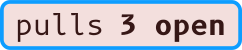
Badges

Status badges for master to embed in a README or anywhere else that takes an image. Every option below is part of the page's address, so you can link to any view of it.

This repository now

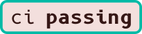
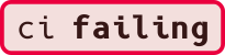
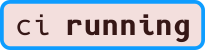
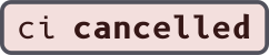
Every badge this repository has, drawn in your current theme. GitGud pages show badges this way, so they change with the reader's theme.

No coverage yet. See reporting to badges below.

Every theme

Fixed to one theme, for embedding where you know the background. Each card sits on its theme's own background. Select a badge to open its image.

Contrast, outline style

Badge text is 11px, so it needs 4.5:1. The status dot is a shape and needs 3:1. Where a theme's usual text color falls short, badges use another, named under the ratio.

Theme label success warning error info GG
light Aa 12.74 base-content Aa 12.74 base-content Aa 12.74 base-content Aa 12.74 base-content Aa 12.74 base-content Aa 16.45 accent
dark Aa 16.80 base-content Aa 4.93 success Aa 5.52 warning Aa 16.80 base-content Aa 6.27 primary Aa 5.02 accent

her Aa 14.47 base-content Aa 12.66 success Aa 14.38 warning Aa 8.76 error Aa 9.97 info Aa 14.72 accent
afterdark Aa 17.38 base-content Aa 14.49 success Aa 16.46 warning Aa 10.03 error Aa 11.41 info Aa 16.86 accent

forest Aa 17.56 base-content Aa 14.41 success Aa 16.37 warning Aa 9.97 error Aa 11.35 info Aa 16.76 accent
sky Aa 17.08 base-content Aa 14.06 success Aa 15.97 warning Aa 9.73 error Aa 11.07 info Aa 16.35 accent
clays Aa 16.87 base-content Aa 14.60 success Aa 16.59 warning Aa 10.10 error Aa 11.50 info Aa 16.99 accent
stones Aa 16.86 base-content Aa 14.69 success Aa 16.69 warning Aa 10.17 error Aa 11.57 info Aa 17.09 accent
blueprint Aa 13.92 base-content Aa 13.84 success Aa 15.73 warning Aa 9.58 error Aa 10.90 info Aa 16.10 accent

Embed

Uses the style, corners, scale and GG setting above. auto follows the reader's light or dark setting on any site that shows SVG. A PNG can't, so the HTML snippet offers a dark and a light image instead.

Preview of the selected badge
Markdown
[![CI status](https://gg.neiam.co/r/neiam/markprompter/badge/ci/outline/2.5x.svg)](https://gg.neiam.co/r/neiam/markprompter/actions)
HTML, separate dark and light images

<a href="https://gg.neiam.co/r/neiam/markprompter/actions">
  <picture>
    <source media="(prefers-color-scheme: dark)" srcset="https://gg.neiam.co/r/neiam/markprompter/badge/ci/outline/2.5x/dark.svg">
    <img alt="CI status" src="https://gg.neiam.co/r/neiam/markprompter/badge/ci/outline/2.5x/light.svg">
  </picture>
</a>
reStructuredText
.. image:: https://gg.neiam.co/r/neiam/markprompter/badge/ci/outline/2.5x.svg
   :target: https://gg.neiam.co/r/neiam/markprompter/actions
   :alt: CI status
AsciiDoc
image:https://gg.neiam.co/r/neiam/markprompter/badge/ci/outline/2.5x.svg[CI status,link=https://gg.neiam.co/r/neiam/markprompter/actions]
Image URL
https://gg.neiam.co/r/neiam/markprompter/badge/ci/outline/2.5x.svg

Reporting to badges

Two job outputs feed the badges. gitgud-coverage takes a percentage: when the job succeeds, the commit gets a coverage status and the coverage badge shows the newest one on master. gitgud-summary says in a few words what a job found, like 1 no fix from an audit: the workflow's badge shows it in place of warning or failing, and so does the job's check on the commit.

jobs:
  test:
    runs-on: docker
    outputs:
      gitgud-coverage: ${{ steps.coverage.outputs.percent }}
    steps:
      - uses: actions/checkout@v4
      - run: mix test --cover
      - id: coverage
        run: echo "percent=87.3" >> "$GITHUB_OUTPUT"
  audit:
    runs-on: docker
    outputs:
      gitgud-conclusion: ${{ steps.scan.outputs.conclusion }}
      gitgud-summary: ${{ steps.scan.outputs.summary }}
    steps:
      - uses: actions/checkout@v4
      - id: scan
        run: |
          echo "conclusion=warning" >> "$GITHUB_OUTPUT"
          echo "summary=1 no fix" >> "$GITHUB_OUTPUT"